Key Takeaways
Selecting the right display format and material is essential for effective visual messaging in professional environments. These fundamental elements ensure your information remains both accessible and visually coherent for your audience.
- Horizontal displays provide a wider viewing area often utilised for comparative charts.
- Vertical, or portrait, orientations align better with natural human eye-level scanning patterns.
- Acrylic stands are prized for their durability and high optical clarity in busy commercial spaces.
- Understanding the difference between standard and premium acrylic will impact your display’s lifespan.
- Proper maintenance and choosing the correct base style directly influence the stability of your signage.
Understanding the versatility of the A4 acrylic stand

The acrylic stand A4 is a foundation of modern tabletop communication, serving as a reliable way to present information that needs to be both visible and easily updated. These units take advantage of acrylic’s transparent nature, ensuring that the message, not the frame, remains the primary focal point of the display area. Whether you are using a standard A4 display holder or a specialised model, the goal is always clear: seamless information delivery. Our team at Acrylic.my routinely works with businesses that require bespoke sizing or integrated branding on these units, as generic stands don’t always match a company’s specific visual identity. Understanding how to integrate these accessories into your existing space helps in maintaining a professional and highly clean visual environment.
Benefits of using acrylic for professional signage
Acrylic stands are favoured for their ability to replicate the aesthetic clarity of glass without the fragility and weight constraints. When businesses require a robust sign holder that stands up to daily use, the lightweight nature of this material allows for easy repositioning on reception desks or retail service counters. Additionally, the optical transparency ensures that your printed messaging is viewed exactly as intended, without the colour casts sometimes associated with lower-grade materials.
Common applications for A4 tabletop units
Your choice of display often mirrors the type of information you need to communicate to customers or visitors at a glance. These units have evolved from basic information holders into key components of modern merchandising. Common uses include:
- Highlighting daily menu specials in a busy café environment.
- Displaying health and safety notices in professional office lobbies.
- Presenting product pricing and features for retail customers.
- Holding direction signs at trade exhibitions or conferences.
Durability and maintenance of clear acrylic
Maintaining the structural integrity and aesthetic appeal of your holders requires a simple but consistent care routine. Acrylic is inherently resistant to impacts, which makes it ideal for high-traffic corridors like those often encountered when redesigning outdoor living spaces. Avoid abrasive cleaners that can cause micro-scratches, instead opting for soft microfibre cloths and mild soapy water to remove dust or smudges. If you neglect maintenance, you might find that small scratches accumulate over time, potentially leading to long-term degradation of the material’s surface quality.
Portrait orientation: When to use it

The portrait orientation remains the standard for most document-based signage where the content is primarily text-heavy. By leveraging the vertical space, you create an design that feels familiar to readers who are conditioned to look at standard letter-sized papers. This format is often a better choice when you have detailed lists or sequential information that follows a downward-reading path. When prioritising strategic placement of these tools, consider the sightlines of your customers as they arrive at your service points.
Ideal use cases for vertical displays
Vertical displays are perfect for documents such as daily event schedules, menu listings that read top-to-bottom, or legal compliance notices. Because the human eye is accustomed to scanning vertically, these stands reduce the cognitive load for someone reading a list of items. It is a preferred choice when your message needs to be captured quickly in small, narrow spaces.
Space efficiency on retail counters
On a crowded point-of-sale desk, every square centimetre matters significantly. A vertical acrylic sign holder A4 allows you to stack more information horizontally along the counter while adding height, which keeps the customer’s line of sight focused on the message rather than the surrounding clutter. This efficiency is why many high-volume retail stores prefer the portrait vs landscape display models for their checkout zones.
Designing for the eye-level reading path
When positioning your stand, ensure that the top third of the document falls near the average standing eye level for adults. If the sign is too low, the downward tilt required to read the information may cause discomfort; if it is set too high, the information becomes lost in the background. Good design involves balancing the Anvil K9 approach to clear communication with a placement that avoids straining the neck, an issue linked to improper posture over long periods.
Landscape orientation: Choosing the horizontal display
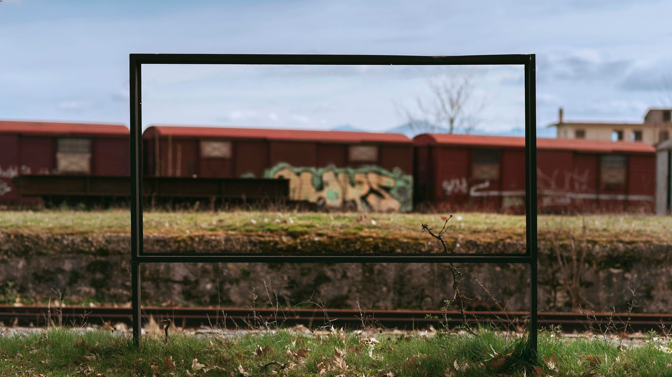
Horizontal orientation provides a wide, expansive feel that is particularly suited for visual content that doesn’t rely solely on vertical scrolling. When a design requires a panoramic layout or a multi-column setup, the landscape format serves that purpose more effectively than a vertical one. This is essential when trying to balance aesthetic harmony in a creative space or an office that requires sophisticated wall displays. A horizontal tabletop menu holder A4 serves this purpose effectively, encouraging the eye to scan from left to right across the full extent of the provided information.
Best scenarios for horizontal signage
Landscape signage is most effective when displaying images that are wider than they are tall or when you have comparative data displayed in columns. If your signage includes a horizontal timeline or multiple grouped categories, this format will prevent the need for cramped text that feels cluttered. It invites the visitor to explore the information across the entire width of the display.
Maximising space for charts and tables
When presenting complex data, the arrangement of your content can make or break the recipient’s ability to understand the key figures. The following table illustrates how different display orientations influence data legibility:
| Content Feature | Portrait (Vertical) | Landscape (Horizontal) |
|---|---|---|
| Text-Heavy Lists | Highly Recommended | Generally Avoided |
| Comparative Charts | Moderate Suitability | Best Choice |
| Wide Imagery | Not Recommended | Highly Recommended |
The data above highlights why selecting a landscape format is often superior for charts that demand width. By choosing the right frame, you allow the information to breathe rather than being forced into an unnatural shape.
Impact on customer navigation and information flow
Landscape signage often dictates a different flow to customer navigation because it draws the eye across the path. It works well in environments where you want customers to sweep their gaze over a range of offerings simultaneously. By aligning your perspex A4 frame choices with the intended viewing direction, you can maintain a consistent brand presentation that feels intentional and well-planned.
Material composition and quality of your acrylic stand A4

Not all acrylic products on the market are built with the same level of care or material consistency, which influences both longevity and visual brilliance. Premium materials, such as those used by the fabrication specialists at Acrylic.my, provide superior structural rigidity and resist the yellowing effects of prolonged UV exposure. When reviewing your options, always evaluate the thickness and the purity of the casting method used. A low-cost, thin display may experience flex or cracking under sustained usage, eventually leading to a loss of the professional appearance you aimed to maintain for your clients.
Distinguishing between standard and premium acrylic
Standard acrylic is often sufficient for short-term retail promotions that roll over weekly, whereas premium cast acrylic sheets are designed for long-term corporate displays. Premium versions offer better clarity, fewer microscopic impurities, and a harder, more scratch-resistant surface. Choosing the correct grade is an investment in how your brand is perceived by regular visitors.
Thickness considerations for stability
Thickness is arguably the most critical factor when ensuring your stand won’t wobble or lean due to uneven surface weight. A thicker gauge of material provides the counter-balance necessary to remain stable during routine cleaning or sudden vibrations. If you are ever unsure about the required material gauge, consulting with a fabricator regarding your specific display weight load is advisable, as they can recommend an appropriate acrylic thickness based on the size of your display.
Anti-glare and UV protection options
For displays located near windows or bright indoor lighting, anti-glare coatings are a practical necessity to maintain readability. These finishes prevent the mirror-like reflections that obscure text, allowing the customer to focus on the information directly. Furthermore, UV-protective acrylic is strongly recommended for items that contain important historical documents or high-value printed marketing collateral to prevent colour fading over time.
Choosing the right base style for your display
The geometry of the base defines how your sign sits on the table and how the viewer interacts with it. A well-designed base is not just a secondary feature; it is the structural anchor that determines the angle of the content. A T-shape base is often preferred for double-sided signage visibility, while an L-shape is more suitable for focused, single-sided directions on a reception desk.
L-shape stands for angled viewing
An L-shape design creates a natural, slightly reclined angle that is ideal for customers standing directly in front of the counter. It directs the content upwards toward the viewer’s natural sightline, making it the preferred choice for transactional surfaces. This minimalist profile is easy to clean and maintains a tidy look, even on small surfaces where excess material could clutter the field of view.
T-shape and double-sided alternatives
When your sign needs to be visible from two different booth sides or across a table, a T-shape base is the logical choice. This design provides balance on both sides of the vertical acrylic sheet, making the display stable without the need for a wide footprint. It is perfect for dynamic retail merchandising where you want the same message to reach customers regardless of which side of the counter they approach.
Slanted back versus upright vertical orientation
Deciding between an upright and a slanted back depends heavily on how high the customer’s average eye level is relative to the desk surface. An upright stand is excellent for posters placed at a higher shelf level, where the sign is at or above the viewer’s eye height. Conversely, the slanted back is better for low-profile counters, ensuring the information is legible at a downwards-leaning angle without the user needing to hover directly over the stand.
Best practices for print design in A4 displays
Even the highest quality display stand cannot compensate for poor print design that interferes with the hardware itself. The most common pitfall involves failing to account for the frame’s edges, which often partially obscure the margins of your paper. If your design relies on information right at the edge of the page, you have to request a quote for a perfectly sized display or adjust your design margins accordingly to stay within the visible area.
Setting margins to avoid stand interference
Always ensure that your essential text sits comfortably at least 15mm away from all four edges of your A4 document. This buffer zone acts as a safety margin, preventing the frame’s grip or decorative trim from cutting into critical information like pricing, phone numbers, or QR codes. When you treat your paper layout as if it were a physical component of the stand, you ensure a professional outcome every time.
Choosing paper stock for clear plastic holders
Using plain, lightweight printer paper can sometimes lead to the sheet curling or shifting inside the display, especially in spaces with humidity or high airflow. Selecting a slightly heavier card stock—around 120gsm to 160gsm—provides a sturdy, crisp background that resists sagging. A thicker stock also ensures that you don’t see images from the backside if your stand is double-sided, creating a clean look that highlights your professional attention to detail.
Optimising readability at a desk or counter distance
At a typical viewing distance of one to two metres, your typography must be bold and simple enough to process within a second. Avoid overly decorative fonts, instead prioritising clean sans-serif typefaces that are legible from across an aisle. A good rule of thumb is to keep headlines at 24pt or larger, ensuring that even a cursory glance provides the intended value to your customer, a practice that mirrors the standards found in modern signage solutions.
Conclusion
Choosing the correct acrylic display involves balancing the physical needs of your space with the visual requirements of your brand to create an effective information hub. By focusing on orientations that align with human reading patterns, choosing the right material grade, and keeping your print design clear, you ensure that every stand contributes positively to your professional environment.
Frequently Asked Questions
Is it better to choose portrait or landscape for a menu?
Portrait is typically better for menus that list items vertically, as it reflects how people usually scan columns of information. Landscape is only recommended if your menu layout is intentionally designed into broad, visual-heavy sections that require width rather than height.
How do I prevent fingerprints on my clear acrylic sign holder?
Fingerprints are inevitable in high-traffic areas, but you can minimize them by ensuring the base is sturdy enough that people don’t need to touch the clear surface to move it. For cleaning, use a damp microfibre cloth; occasionally applying an anti-static polish can also help prevent dust and finger oils from adhering to the material.
Can I use my acrylic sign holder outdoors?
Standard acrylic is not designed for harsh, long-term outdoor exposure. Sun damage over time can cause yellowing or brittleness, and wind can easily knock over tabletop stands. If you must use them outdoors, look for UV-stabilised acrylic and ensure the base is weighted or secured to prevent it from moving in the breeze.
Should I use thin or thick acrylic sheets for my desk displays?
Thicker sheets are always preferable for stability and premium appeal. Very thin acrylic (below 2mm) tends to flex, which can make the display feel cheap and prone to sagging over time. Aim for a thickness that feels solid to the touch and provides enough weight to stop the stand from sliding on smooth desks.
How often should I update the prints in my displays?
Updates depend on your business goals, but signage should feel fresh and relevant at all times. If a price or promotion is outdated, the sign loses its utility and can negatively impact the customer’s perception of your professionalism, so weekly or monthly reviews are generally encouraged.
Are all acrylic stands clear?
While most common holders are clear for maximum visibility, there are many options available in frosted, white, or black finishes. These are often used for aesthetic purposes to match interior branding or to provide a solid background for text that might otherwise be difficult to read in bright light.
What can I do if my display stand seems unstable?
If your stand feels wobbly, the first step is to check if the base is resting on a level, clean surface. Sometimes, adding small, clear rubber grips or felt pads to the bottom of the base can provide the necessary traction to keep it firmly in position without distracting from the overall design.